
I went to QuiltCon and had a great time. I want to keep track of my favorite photos of friends and some inspirational bits and pieces.
I went to QuiltCon and had a great time. I want to keep track of my favorite photos of friends and some inspirational bits and pieces.
Filed under A2MQG, Inspiration

Ooooo it’s been a busy summer. I made this quilt a while ago and have been meaning to blog about it forever. But then this morning I got some great news – Folded Flock is going to be in the International Quilt Show’s Modern Quilt Guild showcase in Houston!
This quilt features the Botanics line by Carolyn Friedlander. The quilting was done on my walking foot. One large arrow shape echoed many times.

This quilt was inspired by origami cranes and this rug designed by Lesley Barnes. I sketched out my idea on the computer. Birds and arrows.
I made the wings, head, body for my birds and used extra background fabric to flesh them out into rectangular blocks. I’ve made another post – here – describing more about how I slabbed together fabric to make my bird and arrow blocks! Thanks for stopping by!
Filed under Fabric, Inspiration, Pattern, Quilting, Techniques
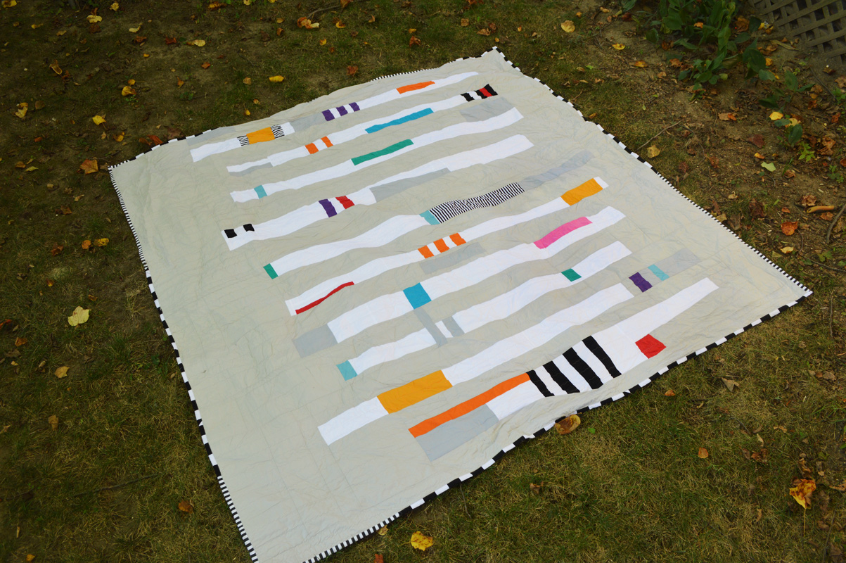
My sister in law recently acquired a piece by YURI MASNYJ and decided she wants to hang it in her bedroom – where she will be sure to see it everyday.
This lead to her desire to have a new quilt for her king-sized bed that would coordinate with the print and the variety of other beautiful artworks she has in her room. (She runs an art gallery and her whole house features AMAZING art.)
I was super honored that she commissioned me to come up with a quilt! We worked together on the design, and after seeing THIS quilt and THIS quilt I came up with this sketch:

And then it was off to the races! I drew a grid over my sketch to help me keep track of the proportions:

Each row was developed and built out, then framed with grey. The rows were then joined and the final border was fleshed out until I had my desired width.

My Bernina people said that they would never try to quilt a King on their machine. I have a 550 QE and I just didn’t want to give up and send it to a quilter without giving it a try – especially since I knew I really wanted a version of straight line quilting! I used a thin cotton batting and am happy to report that with my walking foot and ziggy zaggy stitch 16, as well as a large table with chairs around helping support the blanket, AND some clean gardening gloves to aid in my guiding of the fabric, I really had ZERO problems quilting this blanket. Zig Zag stitches every 1.5 – 3.5 inches throughout the entire blanket. I did it in two sittings.
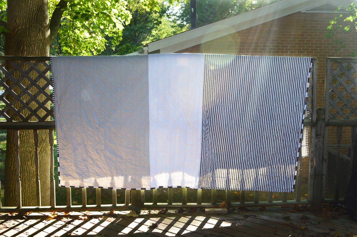
The backing is three panels: stripes, white and grey. The binding is stripe fabric (an homage to Red Pepper Quilts): some skinny stripes, some wider.
I am looking forward to making this quilt a little sister someday! I’d love to play with this design again on a smaller scale.
Filed under Fabric, Inspiration, Quilting
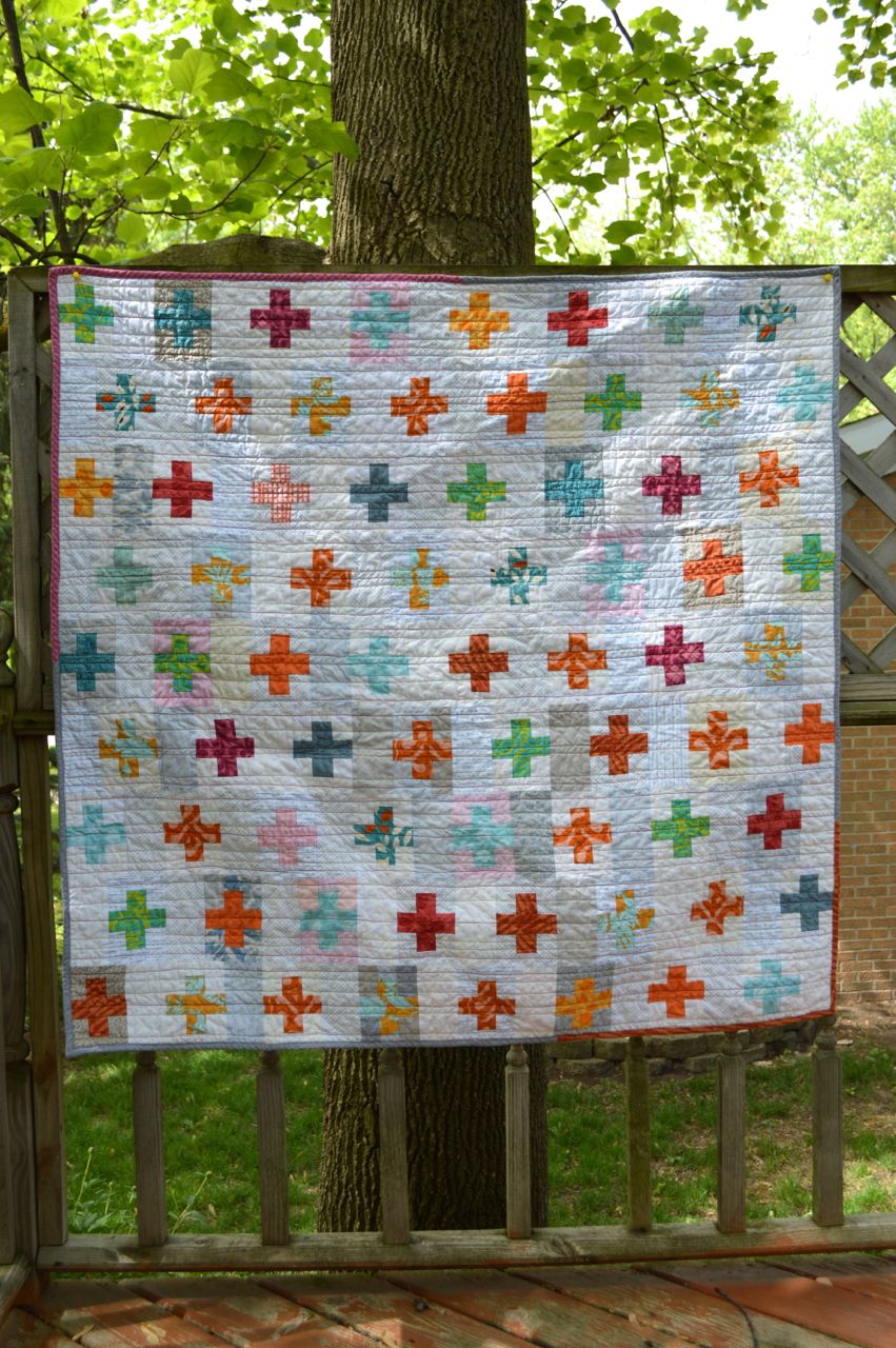 A friend-of-the-family is having a baby! The couple are both very mathematically inclined, modern, and cool. They are expecting a baby girl, but aren’t interested in over-the-top-girly-goo-goo-gaa-gaa things.

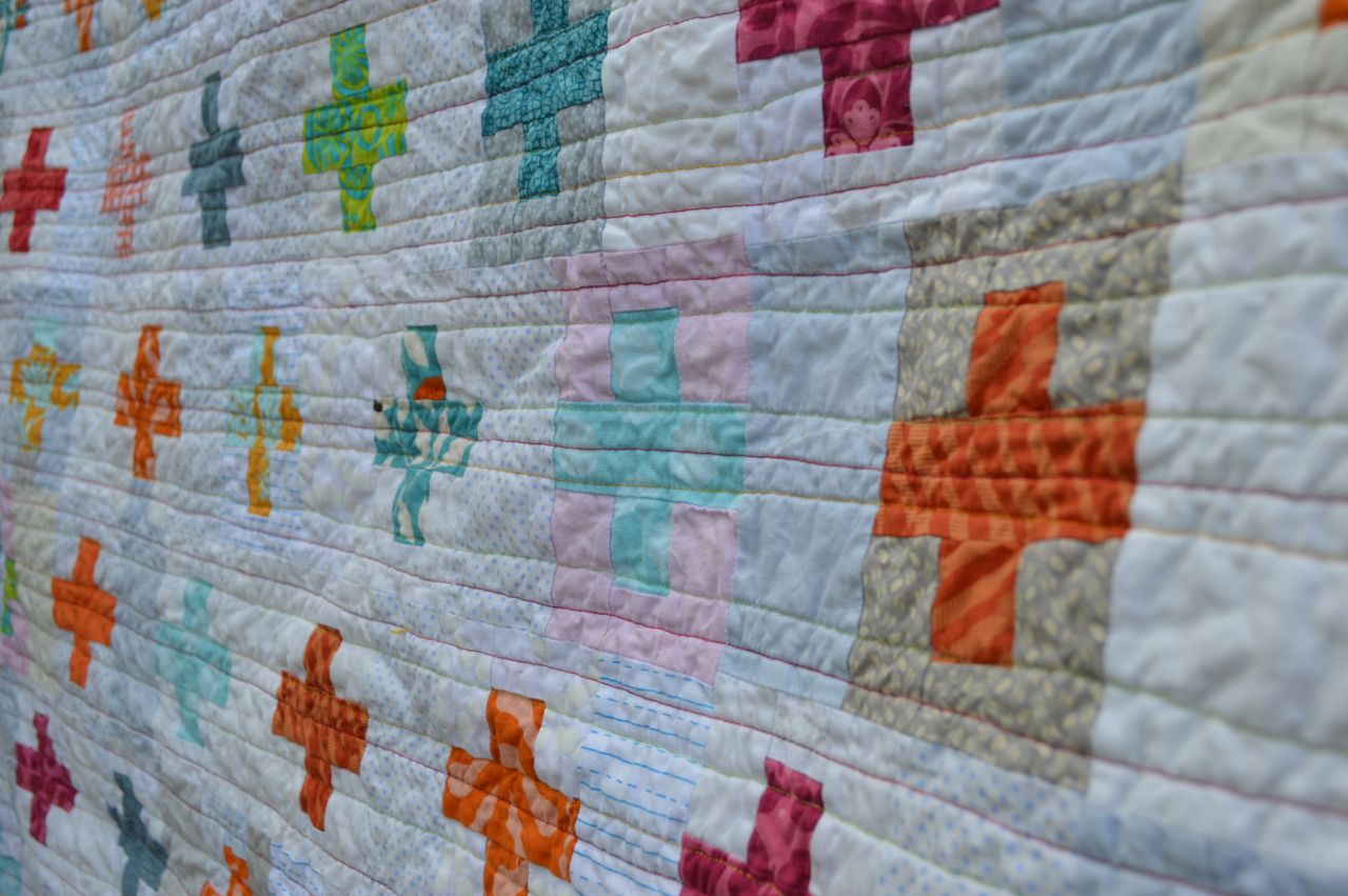
After seeing Debbie’s quilt and this one from Film in the Fridge, I decided to make this plus block blanket. Assorted greys, whites, and a bit of pink work for the background, and the pluses are primarily orange, teal, blue, or pink. I really love how this turned out!

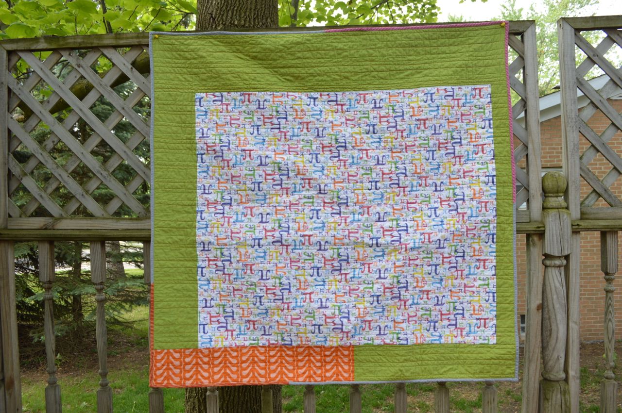
And for the back? My mother-in-law asked if I’d be able to find Pi symbol fabric for these engineers. Of course! I framed a yard of the Pi fabric with green and a splash of orange. The binding is a teensy bit scrappy, with grey and pink and orange.

Thanks for stopping by!
Filed under Inspiration, Quilting
It’s been a long time since I’ve blogged about my Lessons in Modern Art for the Modern Quilter – but I’m back!
Today we’re looking at Cubism – hello, Picasso!

The style of Cubism was popular from 1907 – 1922. Cubist artists worked to depict objects as they really were in the world – not as we perceive them.
To better understand this movement, let’s start by considering a glass. A drinking glass has a circular opening. However, when we view the glass from an angle at the side, the opening appears to be oval-shaped. The glass has not changed, but our new position has changed the visual representation of the glass. In order to depict a glass as it really is, a cubist painter would break the image of the glass into geometric shapes, and arrange them across a field so that multiple perspectives can be seen at once.
You can see this example in action here, in this small excerpt of Picasso’s Still Life with Compote and Glass, 1914-15:

We see a goblet from the side – noticing the height and shape of the glass’s silhouette, but we also see the circular nature of the cup opening due to its flipped and elevated placement above the goblet body. By tossing aside notions of one-perspective and allowing multiple views to exist on the same canvas, we are able to achieve a fuller understanding for the true nature of the glass. This style of multiple viewpoints is sometimes called simultaneity.
Another prominent Cubist artist was Georges Braque. I love this piece where he takes the basic shapes of a violin, separates them into individual geometric pieces, and spreads them out so we can fully gather his impression of the instrument.
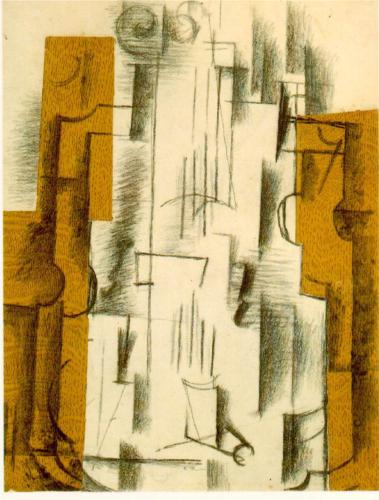
Still life with a violin, 1912, Georges Braque
See the works of : Pablo Picasso, Georges Braque
The concept of taking an object and breaking it down into it’s basic geometric shape is very familiar to us quilters! And it should be noted that the cubist movement has been a very prominent source of inspiration for art quilters, who respond to the realism aspect and create a portrait of an object through fabric piecing, applique, and yes- sometimes glue!
But one modern quilt that comes to mind when I think of Cubism is the popular, intricate, lovely “Space Dust” quilt pattern from Tula Pink. Here we gather the full impression of a cratered moon through the artful arrangement of triangles.

Space Dust Quilt Pattern by Tula Pink available HERE
Key Sources: theartstory.org, metmuseum.org
Filed under Inspiration
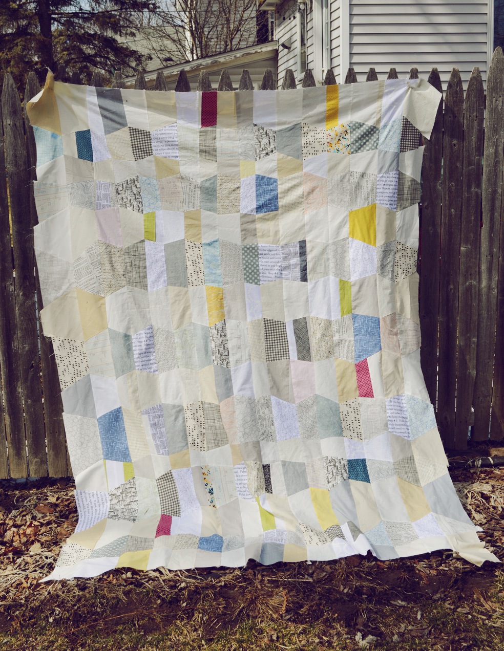
After seeing THIS IMAGE float around pinterest ( “Trapezoid Love” by Melanie Mikecz), I knew I wanted to do a wonky tumbler quilt. And, like the inspiration piece, I wanted my points to match. Wow… how was I going to make a liberated trapezoid quilt (no meticulous calculating and template-making), and still get the points to match?

It took a couple of unsuccessful trial runs before coming up with this method. It’s not for everyone – at the end, you’ve got the entire quilt-top in your lap and you’re completing seams and wrestling and it’s a bit gnarly. But I LOVE the final product. I see more of these in my future…
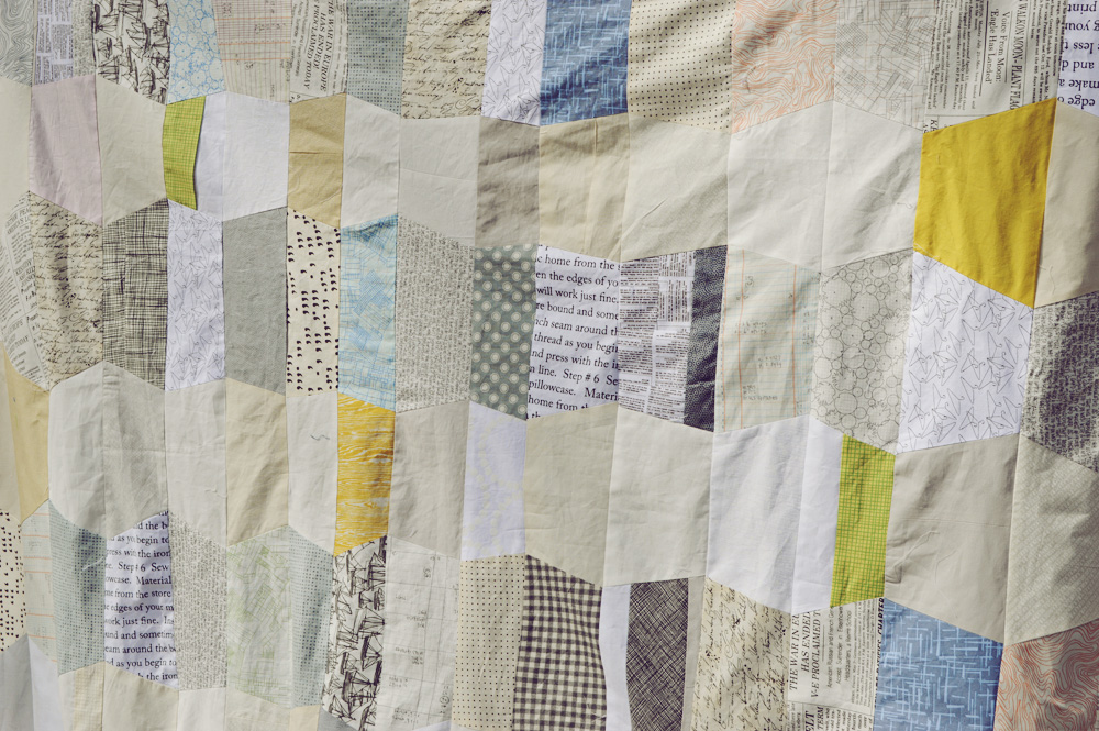
I’ll chat a bit more about this quilt when I finish quilting it and binding it, but for now – a full tutorial! I have no idea if the below will make any sense, but I tried my best and… you know… it’s free for you to read.
Filed under Fabric, Inspiration, Pattern, Techniques, Tutorial
In today’s Lessons in Modern Art for the Modern Quilter, we’ll examine the Italian tech-savvy artists of their time — the Futurists!
From about 1910 – 1920 an unofficial group of Italian artists became fascinated with modern technologies, and the new urban environment. They wanted to make art that truly embraced the hustle-and-bustle of a metropolis. How can flat paintings convey the tremendous motion of a busy city?
The new technology of chrono-photography showed these artists one way to show movement within a static frame. Chronophotography was the use of a special camera (one with many lenses – as many as 12) that would take several pictures in rapid succession. These frames could then be displayed together or even overlapped to convey movement.

a sample of “Chronophotographie d’un chien courant” by Étienne-Jules Marey
Compare the chronophotigraphic work above to this Futurist painting by Giacomo Balla. True story, this is one of my favorite paintings : )

Dynamism of A Dog on a Leash (1912) by Giacomo Balla
There were also major developments in the Optical Sciences during this time. Artists interpreted the theories presented in recent scientific developments to mean that colors would get a stronger luminescence if pure, unmixed dots or strokes of pigments were set next to each other. Then the viewer would mix the dot colors together with their eyes, creating a more vivid look to the work. This method of painting is called Divisionism and is a by-product of the Impressionist movement of Pointillism. Pointillism was more focused on the paint-stroke style of juxtaposing pigment dots, and was not as concerned about the optical science basis of the separation of colors.
The most famous example of pointillism is this “A Sunday on La Grande Jatte” by Georges Seurat in 1884. Here is an extreme close-up so that you can see the many dots of pigments:

For a look at the Divisionist technique we can look at this:

Sea = Dancer (1914) by Gino Severini
Not only does this work showcase the brush style of many small quick, unmixed strokes to create a vivid color representation, but it also is conveys movement and an even 3-D quality.
Combining the theories of technology and Pointillism / Divisonism, I believe the pixelated quilt trend, now offered as a class by Caro Sheridan, gels with a discussion of Futurism. My favorite pixelated quilt? Hello! The Ron Swanson quilt by Monica Solorio-Snow who blogs at thehappyzombie.com :

Image used with permission. The Ron Swanson quilt by Monica Solorio-Snow
Digital photography has become the norm and with that comes the use of computer photo-editing software. Concerns regarding DPI (dots per inch) or PPI (pixels per inch) have crossed over from the technological world into our sewing designs! Modern Quilters certainly are linked to modern technologies – uploading images to their blogs, joining link-up parties, using every latest mode of social media; we can use the term MODERN to mean of-the-moment and up-to-speed, but it’s also fun to look at the Modern Art style of Futurism and see the comparisons with our modern quilting movement.
Key Sources: theartstory.org and guggenheim.org
Filed under Inspiration
By the turn of the 19th century, colonialists and explorers transported African art to Europe. Having stolen or otherwise obtained the items, the works were often sold to pawn shops or trinket stores. However, after time the creations gained artistic appreciation and were showcased in a variety of galleries and added to personal art collections. Maurice de Vlaminck, André Derain, and Henri Matisse, and Pablo Picasso were all known to have collections of art from Africa. As the world broadened, exposure to the artistic works of other cultures heavily influenced the future of Western Art… so let’s take a further look into the response of Modern painters towards African art.
Here were representations of the human form that focused on the spiritual and eliciting emotion rather than achieving accurate, literal representations.
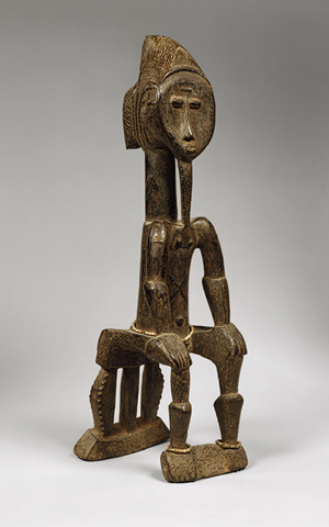
Seated Male, 19th–20th century – Côte d’Ivoire
Referred pejoratively as “Primitive Art,” these artifacts were not seen as having artistic value until the Expressionist and Fauvist painters and sculptors started collecting the works and creating their own art heavily influenced from these African forms.
Even without any understanding of these distant cultures, Western artists could sense the spirituality evoked from these avant-garde forms. With their other-worldly, exaggerated, elongated, transformed and imaginative representations of human features – African art transported the viewer outside of the literal everyday. Freed from the restrictions of depicting naturalistic representations of the corporal form, artists tapped into their imaginations and into their own spiritual sides as they created art from visions within the human mind and soul.
“I paint things not as they look, but how I see them” – Pablo Picasso
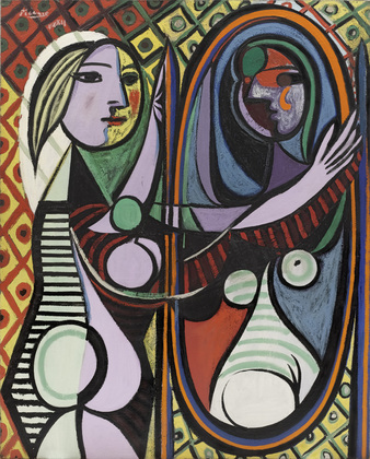
Girl before a Mirror –
Pablo Picasso – 1932
Key Sources: artguidenw.com, metmuseum.org
Tapping into unknown cultures, drawing inspiration from the works of “isolated” communities, certainly one thinks of the profound impact exposure to the quilts of Gee’s Bend had on the birth Modern Quilting movement.

Lucy T. Pettway – “Housetop” – 1945
Living in rural, geographically isolated Gee’s Bend, Alabama, a society of hard-working women used what fabric scraps were available to create glorious, graphic, imaginative quilts in order to keep their families warm.
“The compositions of these quilts contrast dramatically with the ordered regularity associated with many styles of Euro-American quiltmaking. There’s a brilliant, improvisational range of approaches to composition that is more often associated with the inventiveness and power of the leading 20th-century abstract painters than it is with textile-making,” says Alvia Wardlaw, curator of Modern and Contemporary Art at the Museum of Fine Arts.
The world of quilt making was forever changed after the discovery (and subsequent exploitation – can I say that?) of these magnificent creations, heavily inspiring the work of Modern Quilting founders including Denyse Schmidt – check out THIS QUILT and THIS ONE.
Filed under Inspiration
In today’s Lessons in Modern Art for the Modern Quilter, it’s time to Express Yourself! That’s right, we’re at the period of emotional, introspective art that emerged from 1905 throughout the early 1930s that we know as Expressionism.
The Expressionists continued the style of symbolic color usage popularized by the Fauvists. However, these new painters turned to inspiration within their own emotions rather than their literal surroundings. Increased urbanization, as well as the frightening, alienating experience of war created a sense of heightened emotions that started to take prominence in the work of these artists. The subject matter of these pieces became more abstract and sometimes completely isolated from the task of describing physical objects. This was truly the birth of the abstract art movement.

Paul Klee – Affected place (1922)

Paul Klee – “Highways and Byways” (1929)
Expressionist art can be evaluated based on how successfully the artists conveyed his or her emotions, rather than the quality of the representation of a landscape, person, or object. Many of the most prominent Expressionist painters were also musicians. Here, you can see how Kandinsky’s bright, joyous colors almost vibrate with musical tones:
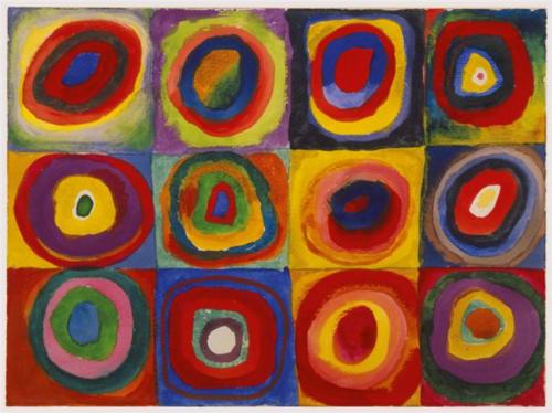
Color Study: Squares with Concentric Circles- Wassily Kandinsky- 1913
See the works of : Wassily Kandinsky, Paul Klee
There are many wonderful Modern quilts that reflect the work of these Expressionists. All of the bright string quilts featured in THIS FLICKR GROUP are reminiscent of the color studies of Kandinsky.
But in terms of a quilt simply evoking an emotion, I wanted to share this T is for Tipsy Quilt by Dorie of Tumbling Blocks:

T is for Tipsy quilt by Dorie Schwarz
Although all of the blocks share the same basic pattern and the color-scheme is relatively monochromatic, the brilliant composition absolutely illustrates the desired “tipsy” emotion. This quilt is playful, liberating, merry-making, and go home T blocks cause you’ve definitely got the spins!
Key Sources: theartstory.org, artfactory.com,
Filed under Inspiration
In today’s Lessons in Modern Art for the Modern Quilter, we mix it up with the “Wild Beasts!” … It’s Fauvism!
From about 1899 – 1908 a group of artists get even more bold with their color choices and the abstract nature of their art. The compositions of these paintings were simpler to accommodate the unnatural and vivid colors.

Portrait of Madame Matisse. (The green line) – Henri Matisse – 1905
There was no concern for if the colors were “realistic,” but rather if the paint choices represented the mood the artist was trying to convey. Here, the colors of the paints were chosen for symbolic purposes and to stir emotion.
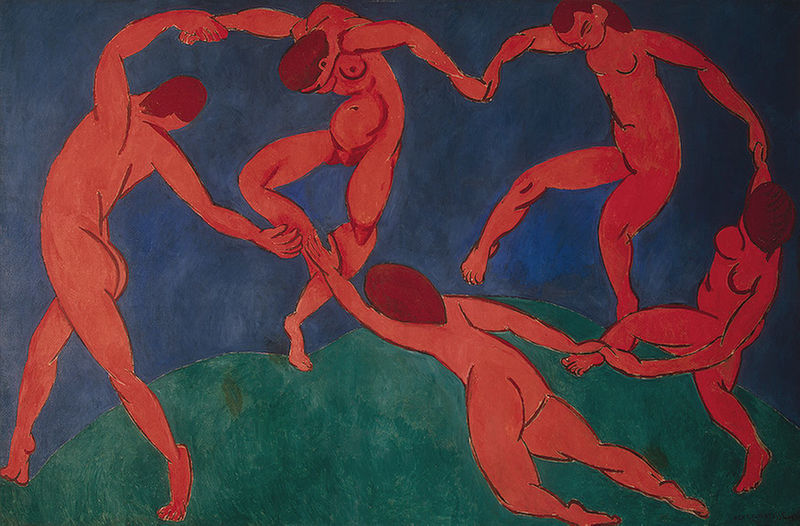
La danse (second version) – Henri Matisse – 1909 – 1910
See the works of: Henri Matisse, André Derain

La Gerbe – 1953 – Henri Matisse
I want to include these pieces here, eventhough they were not created until the 1940s and 50s. In the 1940s Matisse became sick with cancer and had to undergo several surgeries. Life in a wheelchair did not hinder his art, as Matisse began to create beautifully vivid paper-cutout pieces called gouaches découpés.
I’ve always thought these pieces would make fantastic applique quilts : )

The Fall of Icarus – Henri Matisse – 1943
I also wanted to include a picture of this brilliant quilt (blogged here – image used with permission) as an example of the power of color choice. This is a beautiful blanket, made all the more stirring by it’s use of highly contrasting solid fabrics.
Although perhaps not unique to Modern Quilts, the saturated nature of solid fabrics common in Modern projects reflects the appreciation for vivid, bold colors found within the Fauvist movement.
Key Sources: theartstory.org and metmuseum.org
Filed under Inspiration


